Advanced Typography / Final Compilation & Relfection
24 / 04 / 2025 — 24 / 07 / 2025 (Week 01 — Week 14)
Zhou Yutong/ 0378676GCD 61004 / Advanced Typography / Bachelor of Design (Hons) in Creative Media / Taylor's University
Final Compilation & Reflection
TABLE OF CONTENT
REFLECTION
21.04.2025 - 12.05.2025 ( Week 1 - Week 4)
EXERCISE 1: TYPOGRAPHY SYSTEM
EXERCISE 2: Finding Type
15/05/2025 – 12/06/2025(Week 5-Week8)
Task 2 (A) — Key Artwork
REFLECTION
INSTRUCTIONS
TASK 1 / EXERCISES
21.04.2025 - 12.05.2025 ( Week 1 - Week 4)EXERCISE 1: TYPOGRAPHY SYSTEM
Fig.1.1Axial week 1 (27/04/25)
Fig1.9 Final Outcome,week 1(29/04/25)
Fig1.10 Final Outcome,grid baseline week 1(29/04/25)
EXERCISE 2: Finding Type
Fig 2.1 Exercise 2 Part 1 JPG Compilation, Week 3 (10/05/2024)
Fig 2.2 Final Poster (10/05/2025)
TASK 2 / Key Artwork and Collateral
15/05/2025 – 12/06/2025(Week 5-Week8)Task 2 (A) — Key Artwork
Fig3.1 Black wordmark on white background, Week 6 (29/05/2024)
Fig 3.2 White wordmark on black background, Week 6 (29/05/2024)
Fig 3.3 Color palette, Week 6 (29/05/2024)
Fig 3.5 Wordmark in lightest shade of colour palette on darkest shade of colour palette, Week 6 (29/05/2025)
Fig 3.6 Key Artwork Animation, Week 7 (04/06/2025)
Fig 3.7 Task 2A PDF Compilation, Week 7 (4/06/2025)
Task 2 (B) – Collateral
TASK 3 / Type Expression and Application
12/06/2025 — 24/07/2025 (Week 08 — Week 14)
Task 3 Final Outcome
Fig 10.1 Finalized Letterforms (PDF), Week 13 (14/07/2025)
Fig 10.3.Font Presentation 3, Week 13 (14/07/2025)
Fig 10.4.Font Presentation 4, Week 13 (14/07/2025)
Fig 10.6 Font Application 1 , Week 13 (14/07/2025)
Fig 10.11 Task 3 PDF Compilation, Week 13 (14/07/2025)
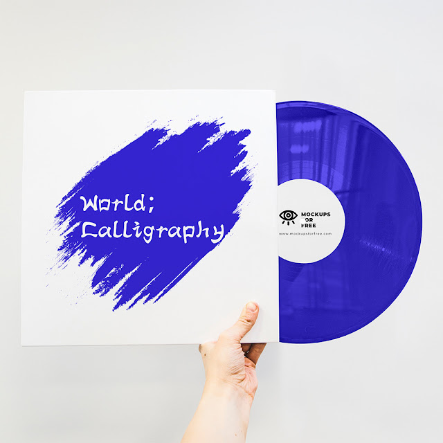
Font Tester – World Calligraphy
The quick brown fox jumps over the lazy dog.
REFLECTION
Experiences
I progressed through three interconnected tasks that built upon each other systematically. I began by researching and applying eight typographic systems, gaining hands-on experience with their characteristics. This foundation led me to explore personal identity through typography in Task 2, where I developed a wordmark inspired by Chinese Clerical Script. My experience culminated in Task 3, where I expanded my wordmark concept into a complete typeface through modular design approaches. Throughout this process, I engaged in continuous cycles of design, feedback, and revision with my instructors, particularly Dr. Vinod, which shaped my understanding and refined my work.
Observations
Several key insights emerged during my typographic exploration. I discovered that everyday objects, like the traditional Chinese ding vessel, can be transformed into distinctive typefaces with cultural resonance. I found the Bilateral System particularly suitable for Chinese design aesthetics due to its emphasis on symmetry. I noticed how the letter "O" in 'Zhou' visually resembled the Chinese character "口", creating an opportunity for playful yet meaningful design elements. I learned that color choice proved more complex than expected - my initial palette based on traditional calligraphy materials (ink, paper, brush) lacked sufficient contrast for visual impact. I also observed that modular splicing approaches, while effective for establishing unified visual language in capitals, created challenges for maintaining consistency in lowercase letters and punctuation.
Findings
My typographic journey revealed fundamental principles about balancing cultural heritage with contemporary design. I learned that successful typography requires harmonizing aesthetic values with practical user needs - a lesson I reinforced when my initial collateral designs lacked contextual clarity. The importance of contrast in color palettes became evident through instructor feedback, leading me to adopt bolder, complementary color choices. Most significantly, I discovered that typography demands viewing letterforms both as artistic expressions and functional tools. The modular design approach taught me about type structure, spacing, and the delicate relationship between conceptual integrity and readability. Ultimately, I found that patience and continuous refinement are essential in typography, and that traditional calligraphic principles can successfully inform modern typeface design when thoughtfully applied.


Comments
Post a Comment