23/6/25 - 13/7/25 Week 9—Week 12
ZHOU YUTONG / 0378676
GCD61004 / Advanced Typography / Bachelor of Design (Honours) in Creative Media
Task 3 Type Exploration and Application
TABLE OF CONTENTINSTRUCTIONS
TASK
FEEDBACK
REFLECTION
FURTURE READING
INSTRUCTIONS
Required Submissions:
- A-Z; Numerals; Punctuation
- Link to your .ttf font.
- 5 font presentations (1024 x 1024 px, 300ppi)
- 5 font applications (1024 x 1024 px, 300ppi)
Task 3 Type Exploration and Application
Proposal
The third proposal was made based on my TASK 2, and at the end, I also chose this idea as the final design for my TASK 3.
Therefore the design context and reference for TASK 2 can still be used.
Fig1.1 Inspirational template, Week 5 (22/05/2025)
SketchesStylized fonts with brushes on paper
Fig 1.2brushes on paper, Week 5 (22/05/2025)
Fig 1.3 Initial sketches, Week 5 (22/05/2025)
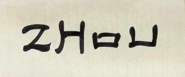
Based on the four letters that had already been designed, I split the bisections and spliced them into new letters, which helped to unify the style.
Fig 2.1put together , Week 13 (14/07/2025)
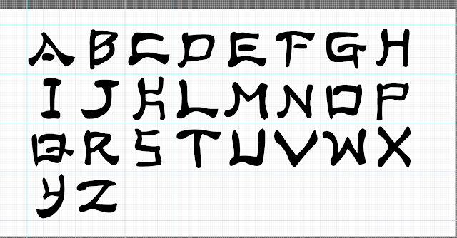
By splicing the strokes, I finished the capital letter display
Fig 2.2.capital letters, Week 13 (14/07/2025)
To prove that I designed the font myself, I will show the font paths.
Fig 2.3.font paths, Week 13 (14/07/2025)
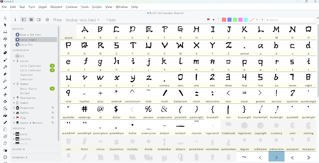
The same splicing continues to make lowercase letters and numerical punctuation marks.
Fig 2.4.put together , Week 13 (14/07/2025)
Fig 2.5.Lowercase letters and numeric punctuation, Week 13 (14/07/2025)
Fig 2.6.font paths, Week 13 (14/07/2025)
Feedback and Adjustments
In the uppercase fonts, there were a few styles that didn't match the others, and the widths of the letters in the lowercase letters weren't very uniform, which I changed at Dr. Vinod's suggestion.
The modification of the capital letter K, for example, is more in keeping with the overall style and more elegant form.
Fig 3.1.font modification, Week 13 (14/07/2025)
Fig 3.2.Uppercase & lowercase letters, Week 13 (14/07/2025)
Fig3.3.font paths, Week 13 (14/07/2025)
Finalized outcome uppercase & lowercase
Fig 3.4 Finalized uppercase & lowercase letterforms, Week 13 (14/07/2025)
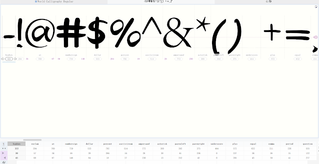
2. Numerals & PunctuationsSince I made a lot of templates for strokes during the process of making the case, I will continue to use splicing for this section.
Fig4.1.Numerals & Punctuations, Week 13 (14/07/2025)
Fig4.2.font paths, Week 13 (14/07/2025)

Fig 4.3 Finalized uppercase & lowercase letterforms, Week 13 (14/07/2025)
FontLab
To create a font, I used the software called 'FontLab' to import my letterform designs.
Fig 5.1 Create page, Week 13 (14/07/2025)
Kerning
Fig 6.1. Uppercase & Lowercase Kerning Week 13 (14/07/2025)
Fig 6.2 Numerals & Punctuation Kerning. Week 13 (14/07/2025)
Font Presentation
Fig 7.1 Colour Palette, Week 13 (14/07/2025)
According to some templates of tdc69, the font display reference, according to my design concept, the first four I chose a simple and classic design to display my fonts, the last one I use highly saturated colors to create a kind of camouflage 3d effect!
Fig 7.2.Font Presentation , Week 13 (14/07/2025)
Finalized Font Presentation artworks
Fig 8.1.Font Presentation 1, Week 13 (14/07/2025)
Fig 8.2.Font Presentation 2, Week 13 (14/07/2025)
Fig 8.3.Font Presentation 3, Week 13 (14/07/2025)
Fig 8.4.Font Presentation 4, Week 13 (14/07/2025)
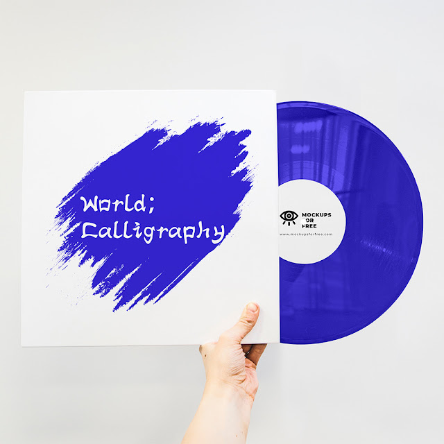
Based on my design concept, I draw on the characteristics of calligraphy to create fonts, I gave the concept of “A celebration of the global tradition of handwriting”, so the font application, I chose a number of carriers that can be applied to handwriting fonts.
Fig 9.1 Font Application , Week 13 (14/07/2025)
Finalized Font Applications
Fig 9.2 Font Application 1 , Week 13 (14/07/2025)
Fig 9.3 Font Application 2 , Week 13 (14/07/2025)
Fig 9.4 Font Application 3 , Week 13 (14/07/2025)
Fig 9.5 Font Application 4 , Week 13 (14/07/2025)
Fig 9.6 Font Application 5 , Week 13 (14/07/2025)
HONOR Competition
Fig 10.1 HONOR Competition, Week 13 (14/07/2025)
Task 3 Final Outcome
Fig 10.1 Finalized Letterforms (PDF), Week 13 (14/07/2025)
Fig 10.2.Font Presentation 2, Week 13 (14/07/2025)
Fig 10.3.Font Presentation 3, Week 13 (14/07/2025)
Fig 10.4.Font Presentation 4, Week 13 (14/07/2025)
Fig 10.5.Font Presentation 5, Week 13 (14/07/2025)
Fig 10.6 Font Application 1 , Week 13 (14/07/2025)
Fig 10.7 Font Application 2 , Week 13 (14/07/2025)
 Fig 10.8 Font Application 3 , Week 13 (14/07/2025)
Fig 10.9 Font Application 4 , Week 13 (14/07/2025)
Fig 10.10 Font Application 5 , Week 13 (14/07/2025)
Fig 10.11 Task 3 PDF Compilation, Week 13 (14/07/2025)
Font Tester – World Calligraphy
The quick brown fox jumps over the lazy dog.The quick brown fox jumps over the lazy dog.
The quick brown fox jumps over the lazy dog.
FEEDBACK
week 14
checking the blog
week 13
After checking your homework, write the blog
week 12
General feedback:Make posters and presentations as required
Specific feedback:no
week 11
Specific feedback: The professor still suggests that I should make the font size consistent, and says that he doesn't want to repeat this point that the case of letters should be similar in style.
week 10
Specific feedback: My professor suggested that I make the font size consistent.
Week 9
Specific feedback: i chose the third of the three ideas and the professor said i could continue but there would be a lot of work to come but i thought it was interesting so i decided to extend my design
REFLECTIONThroughout the development of the fonts for Task 3, I have been on a quest full of novel experiences. This project was a continuation of the concepts from Task 2, and was initially chosen because of its potential for expansion.
In the initial stages of design, it was necessary to split the four previously developed characters and reorganize their fragments into new letter forms. This modular splicing approach helped to establish a unified visual language, especially for capital letters. However, it also created challenges in maintaining the uniformity of lowercase letters and punctuation.
This assignment has greatly deepened my understanding of type structure, spacing, and the delicate balance between concept and readability. Through feedback, I learned to view type not only as a work of art, but also as a practical tool. Typography has taught me patience.
All in all, this project was a rich exploration of how calligraphic traditions influence modern typography. Through continuous refinement and the guidance of my professors, I developed a complete, coherent typeface that embodies my conceptual intentions and has practical usability.
Future reading《Typographic Systems》
Kimberly Elam categorizes typographic structures into eight typical systems:
Axial System
Elements are arranged along a single axis (horizontally, vertically, or diagonally) to create a sense of order and direction.
Radial System (Radial System)
All elements radiate outward from a central point, often used to emphasize the visual focus.
Dilational System
Similar to the Radial System, but with a greater emphasis on the hierarchy of expansion from the center.
Random System
Apparently chaotic, but with an underlying organizational strategy, used to convey a sense of freedom, dynamism, or organicism.
Grid System (Grid System)
The most classic and common typography, through the grid to organize text and images, focusing on rationality and clarity.
Modular System
Structuring pages in repeating modular units to enhance control and consistency.
Transitional System
Utilizes flow paths or visual trajectories to guide reading order and achieve dynamic visual flow.
Bilateral System
Information is distributed on both sides of the central axis, left and right symmetry, emphasizing stability and balance.












Comments
Post a Comment