Interactive design Project 2 / Website Redesign Prototype
24.04.2025 - .05.2025 (Week 06 – Week 08)
ZHOU YUTONG / 0378676
GCD61004 / Interactive design / Bachelor of Design (Honours) in Creative Media
Project 2 / Website Redesign Prototype
TABLE OF CONTENT
LECTURES
Week 7 | Box Model
1. Display Property
Controls how elements are laid out on the page.
Common types:
block: e.g., <div>, starts on a new line and takes up the full width.
inline: e.g., <span>, stays within a line and does not break text flow.
Others: inline-block, flex, grid.
2. Box Model
HTML elements are boxes, composed of:
Content
Padding
Border
Margin
Each part’s size can be set using CSS units (e.g., px, em, %).
3.Flexbox Layout
An advanced layout system based on the box model.
Flex Container: use display: flex to define it.
Flex Items: the child elements inside the flex container.
Common properties:
flex-direction
justify-content
align-items
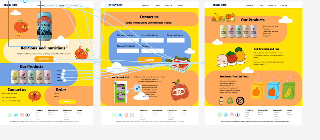
On the basis of the draft of task 1, I used the software to make a viewable image, and asked the teacher about the feasibility of the website, and got the consent to start preparing for the production of project 2.My professor suggested that I shrink the font and change it back to the default font, which I'll do in the next figma design!
Overview of Penny Juice:
This prototype is the result of a redesign of the Penny Juice website, built in Figma based on a pre-proposed redesign proposal to present a more modern, clean and user-friendly interface. The goal of the design was to improve usability, aesthetics, and better communicate the brand's identity to a primary audience of childcare providers and parents.
The goals of the redesign included reducing visual clutter, optimizing the content structure, improving the user navigation experience, and creating a unified brand identity.
Key features of the prototype:
1. Simplified visual feel
The new prototype adopts a cleaner color scheme, reducing the highly saturated rainbow background of the original website, and using white space and soft colors as visual guides, while avoiding distraction to the user's attention.
2. Improved Navigation Structure
The top navigation bar has been redesigned into four clearer columns: Home, About, Products, and Contact Us. Each column points to an independent content block, avoiding the confusion of the original website, which is “one page full of all information”.
3. Modular layout
The home page uses a modular grid system, which divides the content into a number of card-type blocks (such as product categories, customer feedback, brand advantages, etc.) to improve navigability and facilitate responsive display on different devices.
4. Product display optimization
The “Select Product” section adopts a card-type layout with a combination of pictures and text, clearly presenting product images, names and brief descriptions, and is equipped with an obvious “Order Now” button. Compared with the original website where the product display was cluttered and unclear, the current design is more conducive to users' quick identification and selection.
5. Readable typography
The overall font size is in line with accessibility and mobile reading requirements.
6. Interactive Form
A simple order/inquiry form is embedded at the bottom of the page, which allows users to quickly fill in information such as: cell phone number, email, address, product selection, quantity, etc. The form is designed with rounded input boxes.
7. Consistent brand style
Through the use of the new logo and clear image selection, the overall brand image is more professional and friendly. The color tone and typography are also consistent with the style of a children's juice brand, reflecting the brand tone of trustworthiness and liveliness.
Design decisions during development:
Simplification of the rainbow background: Early on, we decided to abandon the original full-page rainbow background, which was childish but seriously affected readability. Instead, the new version uses local color accents to retain the sense of liveliness while improving visual comfort.
Grid Layout System: In order to ensure clean content and facilitate responsive design, it was decided early on to adopt a flexible grid layout, which is suitable for displaying on multiple terminals.
Component consistency: Unified buttons, cards, forms and other components were built in Figma to maintain interface consistency and improve development efficiency.
Image selection strategy: The images used in the new design focus on the freshness of juice and children's life scenes, avoiding the use of low-quality clipart images in the original version.
Objectives / and how the prototype achieves them:
Reduce clutter and optimize visual experience: use clear blocks, reduce color distractions, and enhance the hierarchy of headlines and body text.
Improve the clarity of product display: clearly display products through card categories with obvious buttons to guide the operation.
Optimize user navigation: streamline the menu structure, block page layout, and unify the flow of content.
Support responsive adaptation: grid layout, modular structure, good scalability of fonts and images.
Process
figma button interaction:
Page design
Change of designweek 4
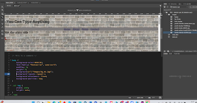
The professor taught us to use Notepad to write code to make a simple web page to introduce ourselves
week 5
Change font, change background color, add submit button
week 6
Change the form of fonts and learn how to use css!
Homework
week 7
Insert images, do submission forms and overall layout.
week 8
Modify the code with last week's knowledge
week 9navigation bar
FEEDBACK
week 9:
Compared to the initial page, my design has definitely improved, but that doesn't mean that my design is a good one.
The professor suggested that I change the size of the font and the width of the page, which he thought looked a bit small now, and create relevant information in the footer
REFLECTION


Comments
Post a Comment