TASK 2 Visual Analysis & Ideation
March 8,2025
24/02/2025 - 8/03/2025 (Week 3 - Week 5)
ZHOU YUTONG / 0378676
Design Principles / Bachelor of Design (Honours) in Creative Media
Task 2
Visual Analysis & Ideation
LISTS
- Lecture
- Task
- Feedback
Lectures
Week 4 :We talk about how you can create a sense of balance and wholeness by repeating specific elements (like colours, shapes and materials). Then, we look at how architects use scale and proportion in architectural drawings and scale models.
Week 5 :This course looks at how words, pictures and symbols are used in design. There are two types of symbols: figurative (like graphic or image symbols) and non-figurative (like abstract or simplified symbols that need to be learned without being associated with anything). Examples (like brand logos and cultural elements) show the value and cultural expression of symbols and emphasise how important it is to combine shapes, colours and clarity in your message to create effective visual communication.
Instructions
Assignment submission requirements:
TASK
A sample of a chosen design

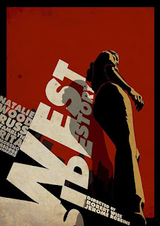
- Name of the Artist/Designer: WEST SIDE STORY
- Creation Year: Information not available
- Work Size: Information not available
- Medium Used:Poster
- Gestalt Theory: The fractured ‘REORDERF’ makes use of the Law of Closure, forcing the viewer to take the initiative to complete the complete form of the ‘REORDER’; the unconventional spacing of the four sets of words constitutes the Law of Proximity, which integrates the discrete information into a hierarchical system. The tilted ‘F’ and vertical ‘ROBBINS’ form a directional closure, building a three-dimensional spatial illusion in a two-dimensional plane.
- Contrast and Emphasis: The scarlet ‘WISE’ constitutes a colour contrast in the black and white tone and becomes a semantic anchor; the fragmentation of the letters of ‘DIRECTED’ and the dense arrangement of ‘ROBBINS’ form a contrast between reality and reality, with the former suggesting deconstruction and the latter symbolizing structure. The thickness of the typeface reinforces the visual weight difference.
- Balance: the left-leaning ‘REORDERF’ creates visual weightlessness, while the vertically compressed last name at the bottom acts as a load-bearing wall, counteracting the dynamic tension by means of Asymmetrical Balance
- Movement: the broken spacing of the letters ‘REORDERF’ creates a jumpy reading rhythm, and the stepped mismatch of ‘DIRECTED’ guides the eye in a zigzag pattern. The distribution of the negative space creates a breathing rhythm, which creates a psychodynamic effect of disassembling and reassembling the static text.
- Symbol: the unconventional turn of the letter ‘F’ is not only a typographic experiment, but also a metaphor for the game between Form and Function; ‘WISE’ as the only colour unit not only emphasizes the concept of wisdom, but also suggests a dangerous breakthrough in design thinking with its blood-red hue. The text matrix as a whole constitutes a flat projection of the spatial installation, transforming linguistic symbols into architectural symbols.
- Word and image: the text is removed from its function as an information carrier and acquires image properties through glyph distortion (‘REORDERF’), direction reversal (‘F’), and spatial compression (‘ROBBINS’). The negative space in the black-and-white background becomes the ‘invisible building’, which together with the solid text constitutes a flat montage, realising the transformation of Typography into Spatial Poetry. This pictorialisation of the text confirms McLuhan's prediction that ‘the medium is the message’ - the language of design itself becomes the central narrative.(374 words)
- Incorporating classic drama into posters
- Based on one of the most iconic staircase dialogue scenes from WEST SIDE STORY, I followed this part of the design of the city silhouette in the selection design, and the poster title followed the tilt design
- Highlight poster content with theatre classic choreography
- A very classic dance from the theatre, set in a city at sunset, increasing the use of Gestalt theory and achieving a sense of balance with the text because of the magnification of the characters
- Combining Typography and Dance
- Increase the dynamic sense of the font, as if dancing to the music, to highlight the characteristics of the musical poster, without adding too much content, so that the picture is more concise, the audience can see the focus at a glance!
- Name of the Artist/Designer:West Side Story (Broadway)
- Creation Year: Information not available
- Work Size: 27 x 40
- Medium Used:Poster
- Name of the Artist/Designer:West Side Story - poster by Matt Needle
- Creation Year: Information not available
- Work Size: 27 x 40
- Medium Used:Poster
Feedback
Week 4
Specific feedback:The teacher said that there's no need for so many revisions, and to try to be as concise as possible
General feedback:The bad thing is that I realised that my previous choice was very wrong and it was very difficult to change it, so I decided to change the work
Experience:I didn't choose this one at first, after looking up a lot of information about Seurat's work, I gave up on that choice and chose the current poster, which is a promotional poster for the opera WEST SIDE STORY, and it's interesting to incorporate what I've learnt about TYPO!
Observation:In the process of analysing the works, I found that a competent work of art has many design principles at the same time, or that the designs are just interconnected, and I found many commonalities between famous works and usual designs
Findings:The process of analysing also gave me a lot of ideas as to whether my future works could be done in the same way, and what great techniques and clever ideas I could borrow. It was a journey of exploration and development that helped me to improve my own appreciation, and I found a lot of interesting works in the process of analysing and searching!
 |
| Interesting design |


%2027%20x%2040%20Poster%20-%20Style%20A%20-%20West%20Side%20Story%20(Broadway)%2027%20x%2040%20Poster%20-%20Style%20A.jpg)


Hi, your sketches are clear. I feel that idea 1 has a potential
ReplyDelete