TASK 1-Exploration
February 3,2025
3/02/2025 - 17/02/2025(Week 1 - Week 3)
ZHOU YUTONG / 0378676
Design Principles / Bachelor of Design (Honours) in Creative Media
Task 1 Exploration
LISTS
- Lecture
- Task
- Feedback
Lectures
Week 1 :The document looks at two theories, Gestalt and Contrast, and goes through several Gestalt principles. These include similarity, continuation, closure, proximity, figure/ground, symmetry, order and uniform connectedness.
Week 2 :There are two main types of balance: symmetrical and asymmetrical.The Golden Ratio is a rule that can be used in architecture, painting and design to create visual balance, harmony and structure, making a design more appealing.The Rule of Thirds is a composition guideline used to add dynamism to design, photography, film or painting.Emphasis is used to create dominance and focus in a design, achieved through elements such as colour, shape or value. By highlighting certain elements, designers can guide the viewer's attention and enhance the impact of the design.
Week 3 :
Repetition:Repetition can make a design look dynamic.
The repetition of design elements creates rhythm and patterns.
Variety is essential to keep rhythms exciting and active, and avoid monotony.
Patterns make a design more visually exciting by adding interest to the surface.
Movement:
Movement refers to how a design guides the viewer's eye into, around, and through the composition.
The sense of motion in a visual image comes from the use of shapes, forms, lines, and curves.
Hierarchy:
Hierarchy is basically how you organise your content to communicate information and convey meaning.Visual hierarchy helps viewers to see the most important information first and guides them through the rest.Alignment is all about arranging your elements so that their edges line up in rows or columns, or their bodies align along a centre.Alignment creates a sense of unity and cohesion, which contributes to the overall aesthetic and perceived stability of the design.
Instructions
Assignment submission requirements:

TASK
1) Gestalt theory
 Fig1.1Posters with similar principles: Publicis Singapore (10.2.2025)
- Work Name: Publicis Singapore Festival Greeting Card Advertisement".
Name of the Artist/Designer: Information is not shown.
Creation Year: Information is not shown.
Work Size: Information is not shown.
Medium Used: Poster
Reasons: to convey the relevance of the elements by arranging and grouping them closely together, as the proximity principle of the Gestalt theory suggests that elements in close proximity are seen as a whole, and to make the main elements stand out by contrasting colors to differentiate between the graphic and the background.
2) Contrast

- Work Name: Publicis Singapore Festival Greeting Card Advertisement".
Name of the Artist/Designer: Information is not shown.
Creation Year: Information is not shown.
Work Size: Information is not shown.
Medium Used: Poster
Definition:Contrast is the process of consciously arranging and combining different elements in a design so that they present significant differences in certain aspects to create visual or conceptual tension and impact, thus attracting the audience's attention and enhancing the expressive and communicative power of the design.
In the category of visual design, contrast is mainly reflected in the visual attributes of the elements, such as color, shape, size, thickness, light and dark, texture and other differences.
Common expressions of contrast are color contrast, shape contrast, size contrast, thickness contrast, light and dark contrast, texture contrast, etc.
color contrast

- Work Name: No clear conventional work name. It can be understood as "Suntory Orange Presso and Grape Presso Beverage Advertisement"
- Name of the Artist/Designer: Information not shown
Creation Year: 2020- Work Size: Information not shown
Medium Used: Poster
Reasons: It attracts the viewer's attention through the use of contrasting colors, where key information such as promotional content, product names or campaign deadlines can stand out from the background and increase visual impact.

- Name of the Artist/Designer: Information not available
- Creation Year: Information not available
- Work Size: Information not available
- Medium Used: Poster
Reasons: The text “TO GET AWAY WITH MURDER” is enlarged and colored to immediately attract the viewer's attention. By highlighting the word “MURDER” to direct the viewer's attention, the design conveys a feeling of tension and suspense, and enhances the viewer's sense of anticipation.
4)Balance
.jpg)
- Name of the Artist/Designer: Information not available
- Creation Year: Information not available
- Work Size: Information not available
- Medium Used: Likely digital drawing

- Name of the Artist/Designer: Information not available
- Creation Year: Information not available
- Work Size: Information not available
- Medium Used: Likely digital drawing
6)Movement

- Name of the Artist/Designer: Information not available
- Creation Year: Information not available
- Work Size: Information not available
- Medium Used: Likely digital drawing


- Color
- Composition
- Theme and Style


Fig1.9 Yin Yang symbol (15.2.2025)
- Name of the Artist/Designer: Information not available
- Creation Year: Information not available
- Work Size: Information not available
- Medium Used: Likely digital drawing
Definition:Word and Image refers to the combination and interaction of text (Word) and visuals (Image) in design, where the synergy between the two enhances the effectiveness of information delivery and visual impact. This design approach emphasizes the complementary relationship between text and visuals, making the design more visually appealing while ensuring clearer and more efficient communication of information.
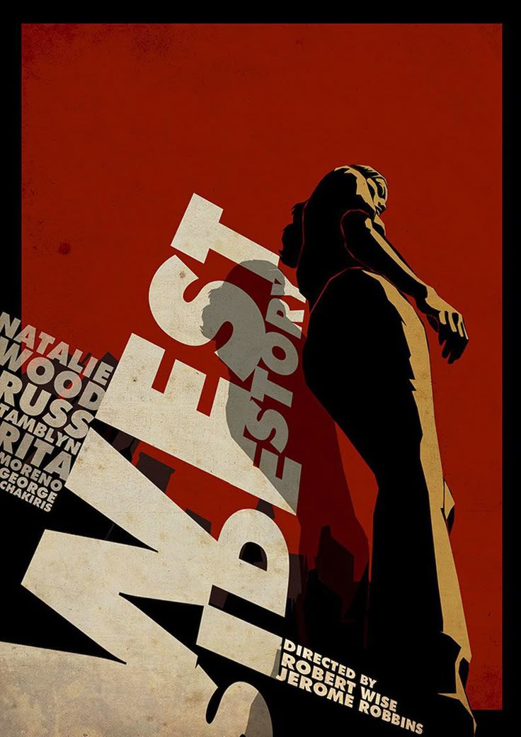
- Name of the Artist/Designer: WEST SIDE STORY
- Creation Year: Information not available
- Work Size: Information not available
- Medium Used:Poster

- Name of the Artist/Designer: WEST SIDE STORY
- Creation Year: Information not available
- Work Size: Information not available
- Medium Used:Poster
- This poster is a great example of the design principles of text and image, blending the image with the intended text, and the author has done a great job of transforming the text into a dynamic visual experience. The design presents fragmented words such as ‘DIRECTED’, ‘REORDERF’, ‘WISE’ and ‘ROBBINS’ in an asymmetrical arrangement. ROBBINS’ so that the boundaries between language and image are not so strong and blend well together. Each word is transformed into a structural element that is constructed in three dimensions by scaling, rotating and deepening the word arrangement, and then enhancing the three-dimensionality by using shading, perspective, superimposition and size contrast.
- The design uses the typeface itself as a narrative vehicle: ‘WISE’ and ‘ROBBINS’ are arranged vertically and horizontally to create a visual hierarchy, and the staggered alignment of the two bold and contrasting words gives the whole poster a sense of movement; by transforming the text into three-dimensional geometrical forms, the effect of the poster goes beyond the simple passage of the words. By transforming the words into a three-dimensional geometric form, the poster goes beyond simply expressing the meaning of the words and invites the audience to participate in the opera performance.
- In this poster, the author's design blends the arrangement of the words with the image to form a visual image that conveys the spatial sense of the poster and the intended message, rather than just the literal meaning of the words.
Feedback
Week 2
Specific feedback:While grading the assignment, the professor pointed out that my choice about the balance was not very correct and asked me to revise it, while at the same time expressing his approval of the design of the contrasts
General feedback:no
Experience:
I use Pinterest to search for relevant designs or posters and go to Wikipedia to search for some classic paintings and use AI to search for the authors of some of the designs, but unfortunately the authors of the web works are hard to find, so I'll just have to put up some of the information that I can find
Observation:
The universality of design principles in our daily life, life is design everywhere, the rational use of design will make life better!
Findings:
I've found many great designs and designers in my collection, and here's an interesting artist I found while collecting one of them
 |
| Probably the last one – Work Over Easy |

Comments
Post a Comment